Archive for category Animation
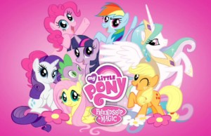
The Surprising Cult-Popularity of My Little Pony
Posted by kjohnson1585 in Animation, Television, Uncategorized, Writing on February 7, 2011
What’s up with the sudden love for MLP?
For those not in the know, MLP stands for My Little Pony. For those really not in the know, the veritable toy line and 80s cartoon was rebooted under the name My Little Pony: Friendship is Magic in 2010 by Hasboro’s own network “The Hub,” to, er, essentially create a new toy line. While there’s nothing new here in conception, the result seems to have given birth to a host of cult fans across the internet, including a few fan forums and chat rooms filled with supporters constantly touting the show’s value. And the scary part is, they are full-grown adults.
Let’s slow down a moment. First, it’s important to emphasize the cult status of the show, especially since Internet popularity doesn’t exactly mean much in terms of the average consumer’s notion of popular culture. In addition, “Buy My Product” cartoons always carry a stigma of blatant financial pandering – a marketer’s paradise where kids line up to acquire action figures, dolls, bedspreads, key chains, pogs (pogs are still a thing, right?), and countless other pieces of merchandise – and maybe, just maybe, they’ll watch the cartoon on occasion.
I often take issue with those instantly dismissive of toy-based entertainment. Sure, it’s obvious that the primary drive is skewed towards the “toyetic” aspect of the franchise versus actually creating a quality cartoon; that doesn’t mean that the cast and crew can’t be dedicated enough to try and create a quality show/movie/comic regardless. Something that’s inherently property-based doesn’t automatically mean it’s shitty – see, Clue. And it’s pretty great to draw as much entertainment from My Little Pony as I would from something like Spongebob Squarepants.
It helps that the show is run by Lauren Faust, wife to Powerpuff Girl and Foster’s Home for Imaginary Friends creator Craig McCracken, whose influences are apparent (the relation between PPG and MLP is so obvious it isn’t worth exploring). Make no mistake, though: it is Faust’s creativity and design that shines through here, to the show’s ultimate benefit. MLP works carefully in defining distinct pony personalities, always an important element in large ensamble TV shows, particularly animated ones (were there any distinctive character in the original MLP or even something like Care Bears?). Its stories are simple but engaging, non-pandering, and disguise its life-lessons well enough in surprising, well-thought out plots and mythologies. It’s a great example of going all out with a simple idea, and reaping the rewards.
Still, it’s popularity is something of a mystery. We’re talking colorful, magical, bright-eyed ponies here, with situations that leave our protagonists afflicted with punned-based diseases, such as – are you ready? – Poison Jokes. (You see, it’s like Poison Oak, but afflicts you with a gag-based symptom.) And while that sounds cringe-inducing, it works very well with the show because of the cast’s commitment to the conflict. There’s no “cutesy-cooties” stories here, and no shoed-in lessons or random-academic facts. Pun aside, Poison Jokes is serious fucking business to the ponies.
Bright, fluid animation with (I assume) Flash and excellent voice talent elevates the show to another level of quality. Solid stories and great characters brings it up another notch (which makes it leagues above the “reptiles talking about nothing” monotony of Dragon Tales – the animated version of Gilmore Girls). However, I’d attribute one extra thing that really makes the show shine beyond more cartoons of a similar nature. You probably didn’t think of this, but this simple feature is what I think allows it to surpass the nature of simple kid’s interest and into genuine, adult-likeability:
Episodes are 22-minutes long.
It always surprises me that more modern-day cartoons don’t adhere to the full 22-minute time frame for an episode, opting to create two 11-minute shorts instead. I’m not referring to the Fox/Comedy Central ‘toons, which are more or less animated sitcoms (although Drawn Together blurred that line), nor to “action” cartoons, like your GI Joes, Transformers, or Marvel/DC animated programs. I refer to what Jeffery Scott in How to Write for Animation calls “squash-and-stretch” cartoons, your mid-day and early evening animation on networks like Nickelodeon or Cartoon Network: Angry Beavers, TUFF Puppy, Regular Show, Chowder, and so on. If an episode of shows like these use all 22 minutes for one self-contained story, it’s probably because it’s a special of some sort. Otherwise, you’re probably getting two shorts instead of one.
Granted, I can understand why it is done. Executives fear alienating the young audience by splitting a show into two parts through commercials. Also, it’s slightly easier to produce two shorts with a team of people (regulating directors and animators focusing on their proper specialties) than it is to collaborate an entire team to one full episode. Still, in the age of DVR and Youtube, and in a time when streamlining the workload is much cheaper and easier, squash-and-stretch cartoons ought to utilize their entire timeslot to the fullest.
Quite frankly, 22-minute episodes tend to be better than the 11-minute ones. The pacing is spread out better and jokes and movements aren’t as crammed together. We can learn about the characters more, get a sense of their personalities and their behaviors, as well as their interactions with each other. Think about it this way: squash-and-stretch cartoons use the 22-minute format during specials mainly to reveal “secrets” or “surprises” about the characters or their world – you know, that thing called “development”. If a squash-and-stretch cartoons worked off the 22-minute template every time, they could “develop” the characters and the world every time. A no-brainer.
The 2 x 11-minute template only leaves room for the story, under the belief that there isn’t a strong need to develop much else to the show besides the plot. With 22-minutes, characters can shine, the plot can create larger stakes, and the limits of the confined setting can be explored to its fullest potential (provided there isn’t any pointless padding). I’m personally not a huge Invader Zim fan, but I’ll admit that loved the pilot and it’s mid-season, planet-riding episode, both of which were 22 minutes. Phineas and Ferb mixes 1 x 22-minutes with 2 x 11-minutes episodes quite frequently, and while both formats are fun, the 1 x 22 have more going for it in terms of character, interactions, and aesthetics. There’s more energy. There’s more investment. There’s more commitment. And this is what I believe makes the My Little Pony show such a treat. Heck, it’s why Sesame Street and Blue’s Clues fairly entertaining to adults, too. It commits us to the entire episode of the show.
While I’ll avoid an entire episode analysis of what works here, a cursory glance at the first five minutes reveals quite a bit. In about thirty seconds, we learn about the two main characters, and a third who apparently controls the clouds. Right after – we hit the ground running with a conflict: all the ponies are in hiding. The plot begins quickly, a la a 11-minute cartoon. But the beats switches quickly to a vaguely sitcomy-type development. In the darkness of the house, we learn point-blank how each pony works and thinks; different voices, actions, behaviors and reactions to this “zebra” illicit similar fears but different responses to that fear. We learn (quite comically, but paramount to in-world development) that they exist in a realm that finds the laws of nature strange, crude, and barbarically horrific. And instead of moving towards the episode climax, the stakes are ratcheted up even higher when the younger pony strikes out on her own to confront this strange striped creature. In essence, we have all the quick-to-the-punch elements of typical 11-minute cartoon, the character-interplay and pacing of a sitcom, and the diegetic development and rising conflict notorious to action cartoons. People may say the writing is good, but it’s because of that 22-minute time frame that the writing can be particularly stellar in conception and execution (bare in mind, the plots are still inherently simplistic, but they go the extra mile to make them appealing).
I’m not rushing to catch every episode, but of the three I have seen, I found myself endeared to the tale being told, mainly because very little of the running time is wasted. Ratcheting up the conflict, keeping the characters distinct and unique (and giving everyone a fair amount of screen time – no one seems wasted), and maintaining those cartoon roots leaves My Little Pony: Friendship is Magic an entertaining, if not too deep, piece of television delight. For comparison, this episode is more sitcomy in plot (a creative take on the other friend replacing you plot-trope), while this one is a more basic, cartoony story (given a harrowing if silly climax). The mixture of elements would be a mess in short form, but 22-minutes is perfect; or should I say, 22-minutes is magic.
More great concept art
Posted by kjohnson1585 in Animation, Television, Uncategorized, Video Games, Webtoon, Writing on December 16, 2010
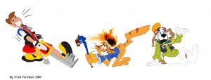
A piece of concept art I had commissioned from the talented nanook123 (Trish Forstner) at Animated Visions:
One of the elements that will be strongly encouraged in the webtoon is the inclusion of smart video game based gags, jokes that go beyond the simplistic and almost insulting types of VG jokes used on most TV shows. (They tend to keep jokes focused on the overall video game aesthetic (running and jumping) and keep to obvious parodies of Pac-Man, Super Mario, Asteroids, Sonic the Hedgehog, and Frogger.)
Since we know that a large percentage of the population play games MODERN games like Fallout, Left 4 Dead, Uncharted, Bioshock, and Kingdom Hearts – I hope to allow plots and stories that homages/parodies these very well-known games, without coming off as pandering.
Beyond that, though, it’s cute, and I think the piece is amusing without fully understanding the game this piece is parodying.
I hope to make one more regular blog update before the New Year.
SUPER MARIO BROS. ADVENTURES – Intro to Comics
Posted by kjohnson1585 in Animation, Comics, Super Mario Comics, Uncategorized, Video Games, Writing on November 30, 2010
Okay, this needs a lengthy introduction.
I mentioned this briefly on my write-up of the Super Mario Bros. movie, but I was, and still am, an unabashed Super Mario fan. I’ve been behind on the games as of late, although I did play Super Mario Bros. Wii and I am currently on-and-off with Super Mario Galaxy. But the premise, background, and history of the Super Mario Brothers universe is almost like a second world to me. I love its whimsical freedom along with its dark undercurrents; it’s really a lighter form of the Harry Potter universe without the genocide.
While my fanship waned (somewhat) over the years, I have amassed a small collection of the available Super Mario Bros. (SMB) comics that were published in the early 90s. There was two overall anthologies: The SMB comics under the Nintendo Comics System, published by Valiant Comics in 1990 and 1991 (which also produced a run of Legend of Zelda and Captain N series), and the Super Mario Adventure volume, which was the compilation of the Nintendo Power series published when that magazine was the best thing out there, back in 1992.
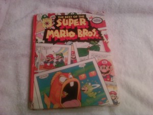
The SMB Valiant series was released in a hardcover edition in 1990, which contains the “Best of” of the lot, not so much all of them. Owning that, and Edition #1, I think I only failed to read 2 others that may exist out there in the void, and these comics are not easy to find. Still, the fact I still have them gives me a sense of… shameful pride? Prideful shame? Something.
I happened upon this blog here, a fellow blogger who reviews and analyzes various Ducktales/Scrooge McDuck Disney comics, and I truly enjoy the write ups, so much so that I decided to do something similar with the collection of SMB comics I have, in addition to the CHILDHOOD REVISITED series, the various updates to the webtoon, and what ever entertainment issue I want to write about. Truth is, I wanted to do this for a while, and mister Geo X just gave me the kick in the pants I needed to start.
I will try to impart as much info as I can about the writers and artists for each of the comics that I can find; truth is, it’s a bit tricky since it was so long ago and it’s difficult to find and confirm that some of these current comic book creators indeed worked on this series. In all honesty, some of these comics are of various quality, and save for one or two, you… wouldn’t really want them in your portfolio. But I’ll try my best to blend together a general recap of the story, a light review, a bit of analysis and information, and some good ol’ fashioned nerd-love for the SMB world.
I’ll go in the order of the hardcover anthology, starting with the first offered comic: “Just Deserts”.
——————-
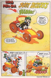
“Just Desserts” is actually a great comic to begin with, as it’s both a good mix of what could be great about this series, as well as what could be flat-out abysmal. Here, the art is fairly decent all around, and the story starts off cute and intriguing, but ends with a “What the fuck” (I don’t do WTF, as W is not a great letter to use as an initial) type of twist that would make Shyamalan look at it incredulously.
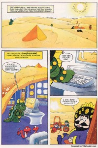
We start of with what looks to be the precursor to Super Mario Kart as well as the introduction of who will be a recurring character:
I’ll talk more about The King, King Toadstool, the father to Princess Toadstool, at length in a future comic where he’s much more prominent, but the basic gist is that he’s a bold, lazy, slightly-arrogant and simple-minded fool. You get the sense that Princess Toadstool does all the real royal duties, but it’s surprisingly clear that 1) she’s her father’s daughter and 2) isn’t as smart as another future recurring character. I’ll talk about him, as well as Princess Toadstool, later as well. I’ll tell you right now, though: I LOVE how the comics portray her.
I digress. Our sibling heroes and king are on their way somewhere – and they get stuck when they run over a cactus and get a flat tire. It’s important to note that here, SMB takes a very cartoony approach to its storylines, unlike something like Sonic the Hedgehog, which is more mystically serious.
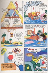
The king lazily forces the brothers to fix the flat. Meanwhile, Bowser is watching their struggle in a hidden, underground pyramid/hideout:
(That is the old design of Bowser, AKA King Koopa, in the days when games were still 8-bit. He’s even called King Koopa in this comic run as well. I’ll get into the revamped villain design later as well.)
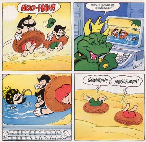
Our king sudden spots a pool nearby, and dives right in. The brothers are skeptical that it might be a mirage, but after watching the king have fun, Mario and Luigi join in —
— only to be duped by the entire scenario being a mirage. The king’s been taken while the brothers been busy, which sets up something pretty creepy: Mario and Luigi have to find him in the HUGE expanse of a barren desert. In theory, this could be a pretty tight adventure. Expect not:
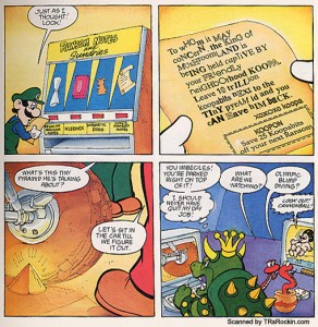
Okay, while the convenience of the ransom note vending machine is pretty lame, it doesn’t kill the plot completely. But where is this tiny pyramid?
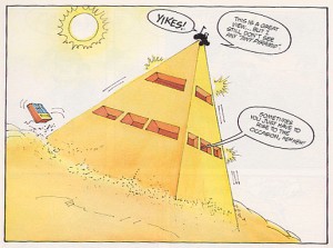
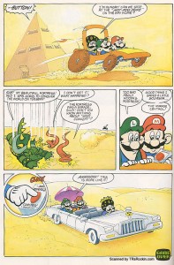
I included this panel because it’s a really awesome canted perspective shot. And Luigi’s right: the pyramid’s big now, so they still don’t know where this “small pyramid” is!
Only one thing to do now: just book it!
This is pretty amusing – the progress cut short by gravity. I really dig how the first panel portrayed that. Also, very convenient, as they find the king AND a nice pool to cool off in. The escape, however is where the problem arises. I mean, the emergency button near the pool is ridiculous but plausible in a far-fetched kind of way, but:
— the idea that the entire thing, pyramid, plan, and all, was a mirage is just too far out there. If it all was a mirage, then how was it originally created? I get that the device didn’t create mirages so much as create realistic holograms, but there’s no way to play the “hologram created the hologram” card without going cross-eyed. It’s a chicken-and-egg problem.
Still, I will say for the most part this is a fun little comic and the art is fairly great all around (although, the settings tend to be better and more consistent than the character designs), with little bits of visual flair here and there to make this issue stand out. Vibrant colors is key to any SMB outing, and here, the artists do a decent job. The writers miss the boat (or should I say limo?) at the end there, but for a primer entry into this series, it’s a decent one.
I should also mention that most of these and the future screenshots and crops are from this site: http://trsrockin.com/ncs_smb.html. I thank them for the scans so I don’t have to scan my edition, which is almost falling apart at the seams anyway. You can read most of the comics there.

