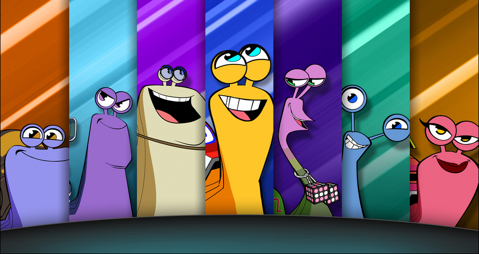
With Turbo FAST’s second season debuting on Netflix on Friday, I had the chance to do a quick email interview with Mike Roush, an animator for Titmouse Animation. Titmouse’s work on the show is visually exemplary, and I personally an advocate for it (I even got the chance to throw my support over it here). Check out the interview below:
Total Media Bridge: How is it working overall on Turbo FAST?
Mike Roush: Turbo was fun to work on. The show had really great animators working on it and it was a pleasure going to dailies and seeing all that they came up with.
TMB: Did Dreamworks have an overall vision of the show when they approached you or did they mostly leave you to your own devices? Were they basically like “do it like Motorcity“?
MR: I did hear that they came to us to make Turbo in part because of the work we did on MOTORCITY. I also heard that they gave us quite a lot of leeway in how the show looked. I am really happen with all the design that went into the show. Here at Titmouse we have super super SUPER talented designers for both BG and character. They should really make a making of this show.
TMB: How does the general workflow work? Are scripts just sent to you and you execute the animation from there? Is the Dreamworks/Netflix workflow any different than the Disney workflow (on Motorcity)? How closely is Titmouse working with the Dreamworks Animation TV studio?
MR: The workflow is different on every show we make whether it be for Disney, Dreamworks or whomever. There are some basic structures that stay the say. Most shows start with a script that gets boarded into an animatic which is the blue print for the rest of production. The animatic is used to design, animate, and composite all the shots to. As for how closely is Dreamworks working with Titmouse I don’t think I would be a good person to ask as I am in the trenches at titmouse and rarely have the time to see the interaction.
TMB: How much freedom are you provided? I definitely noticed some visual gags in the show that seem to be beyond the pages of a script. I’m particularly intrigued by the various graphical pop-ups, like the character-stats graphics. How did ideas like that come about? Was that a collaboration between Titmouse and the Dreamworks writers/producers?
MR: Us animators at Titmouse are give a bit [of] freedom to explore the acting in the shots we are given. [W]e are encouraged to find the humor in the scene and make it stronger as long as it is supportive to the story. Some time an animator will add a joke that we have to cut, not because it is not funny but because it confuses the story tell. When ever that happens it is sad because the jokes normally make us laugh. Once we start animating it is all up to the animators at Titmouse to decide on the animation acting and timing. This will later be looked at by the directors and Dreamworks but they for the most part love what we do.
TMB: Was it tricky to translate the 3D, “grounded” nature of the Turbo movie to the 2D, more elastic nature of the series? Particularly with the snails and the all-purpose usage of their eyestalks – how did that come about?
MR: We love the really cool graphic designs of classic cartoons. We wanted to make a show that continued the story of Turbo but gave the viewer something new visually. We also expanded and developed new locations and characters that using the new style helps make the show [its] own thing. We didn’t want to reinvent what the movie did so well. I think over time we just looser and looser with the models especially with the eyestalks as the show evolved into its current wackier version.
TMB: I noticed that the show perfectly manages to shift in tone quite a bit, say the Super Mario Kart-inspired episode “Mall is Well” to the “The Birds” parody “Turbo Stinks”. Was there any particular episode that proved challenging to work on? Will we be expecting more of that in future episodes?
MR: Yeah we are really looking anywhere and everywhere for story ideas and adventures to put these characters into. One of the [trickier] shows to do was the one you mentioned with the birds. There was a big size difference between a bird and a snail so having Turbo race down a freeway chased by a flock of birds was more difficult to do then we though going into the episode.
TMB: As a follow-up, video game influences are all over this show, from the intensity of the race scenes, to the lighting effects, to the occasional use of pixelation. Is there a fear that that those kinds of influences might be putting audiences off or has that been assisting you in a way that allows you to stand out?
MR: I’m not sure if we thought about it that deeply. I think we just love video games and that 80’s pixelly look so we put it in the show. We try to just make what we think is cool and hope the audiences think it is cool too.
TMB: How much attention has Turbo FAST been getting, from a marketing perspective? And from an audience perspective? Neflix has been notoriously quiet on things like ratings so any insight in that world would be helpful.
MR: You know it [isn’t] pretty quiet from my point of view too. I’d love to see how the show is doing and what kind of products are out there. Every once in a while someone at the studio will bring in a TURBO toy or stuffed animal for us all to see.
TMB: Favorite episode? Favorite character? Favorite moment or gag that particularly stood out for you?
MR: Favorite episode The one from season 1 beyond bummer dome. Favorite character Mel Shellmen the racing announcer. I liked the gag where the Clamsquatch comes out of the swamp to eat Cajun Cliche.
TMB: What kind of insanity should we be expecting from the Turbo FAST crew in the future?
MR: Oh man I wish I could tell ya. All I can tell you is toward the end of season two things get more and more wild. It seems like we are just finding our stride and we are just starting to push these characters to where we want them. Prepare for more crazy.


